2SP Brand Refresh
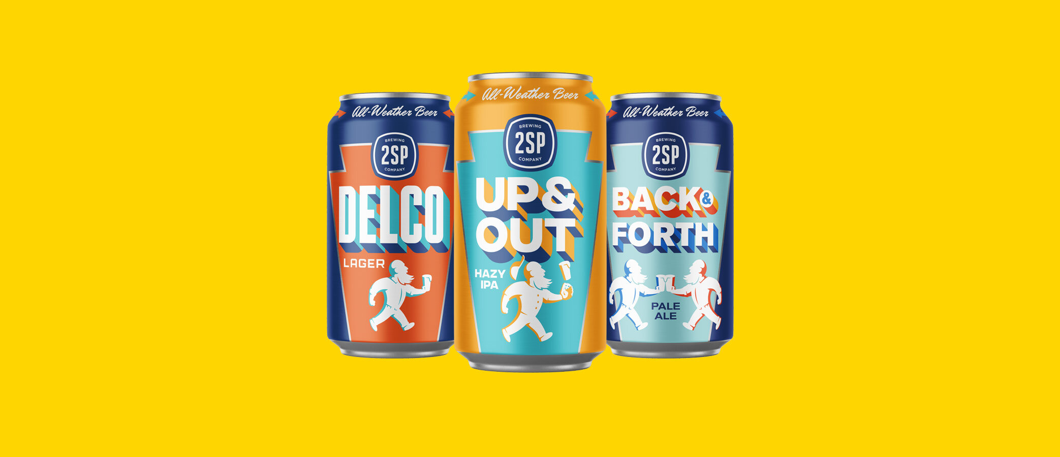
2SP’s core cans were well-loved by buyers and sellers, but new customers didn’t always recognize them as a family. A refresh of the main line up synthesizes some of the brand’s strongest motifs into a distinctive and consistent format. Ahead of their public release this week, the new designs have received overwhelmingly positive reception from distributors, sellers, and 2SP’s staff.
I was Creative & Art Director, primary designer, copywriter, illustrator, and animator on every element of this project.
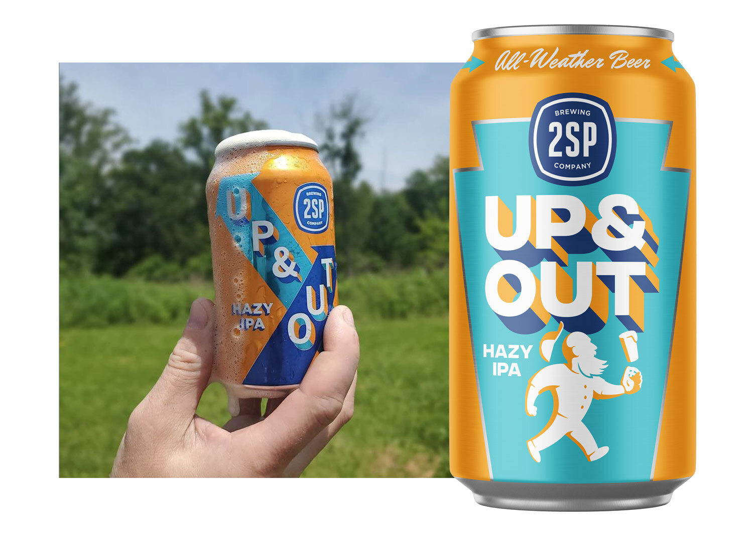
The original line up of cans drew their inspiration from mid-century oil cans, honoring the blue collar roots of the region and the brewery’s founders.
An audit of 2SP’s visual output identified the graphic elements that had come to most define the brand over the years.
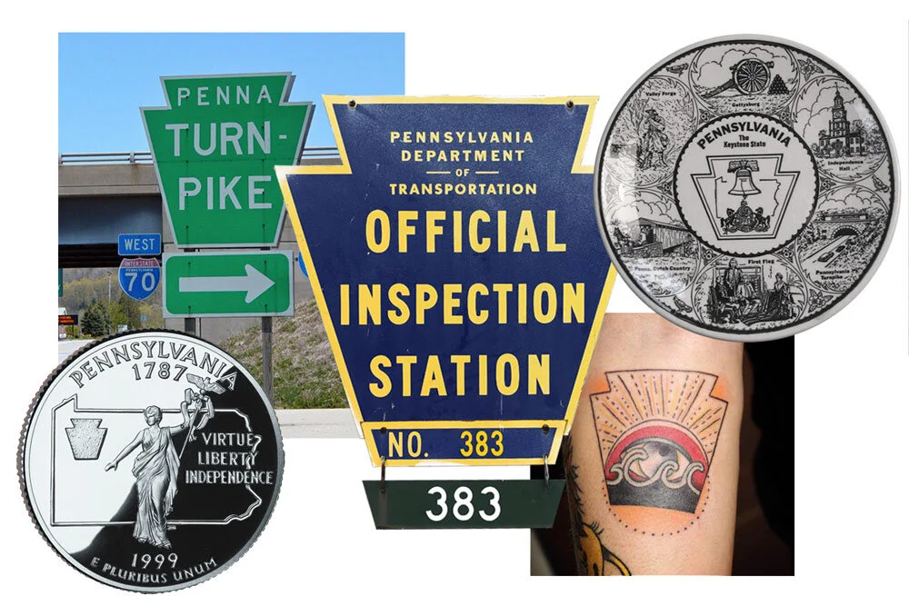
The Pennsylvania keystone—found in official settings, souvenirs, and more—was added to the mix to instill a sense of place. The sharp geometry fits in with the brand’s retro industrial inspiration.
Vertical placement of each beer’s name on the “side” and other stylish touches ensure that no matter how the new cans are turned on a shelf, consumers know what they’re seeing.
For continuity between the old designs and new, each beer largely retained the palette from its previous design.
The best-selling Up & Out is the first 2SP beer to be made available in 12 packs.
A strikingly stripped down and bold design turns the boxes into miniature billboards in stores, while smart and surprising details create a memorable consumer experience.
Another first: 2SP billboards (and matching social media campaign)!
Billboards announce the new look along major highways in Philadelphia. The designs are specific to their locations near the major league stadiums and airport. An illustration of a famed older stadium and a casual colloquial tone reflect 2SP’s local roots.
A rotating line-up of designs will appear on a digital billboard in Delaware County (AKA Delco) near the exit for the brewery.
Animated variations on the designs will appear concurrently on Instagram, as posts and Stories.
Everything above was designed for the initial release of the new look. More coming soon, some from me and some from 2SP’s in-house designer who’s been a great sounding board and collaborator for several aspects of this project.


